Made to Stick
Made to Stick is one of the most influential books that I have ever read. Period. It’s a book so important that I cannot stop recommending it to everyone who is about to give any kind of talk, pitch or presentation.
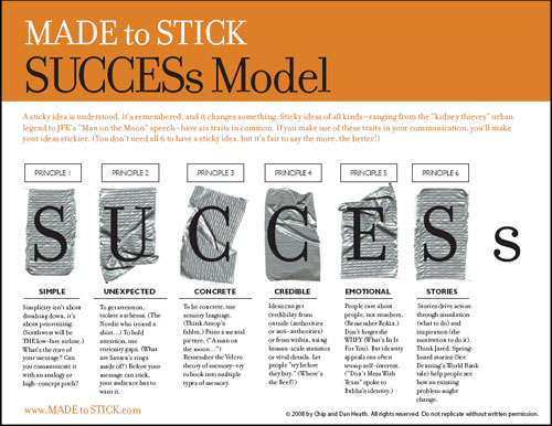
The message is simple: there are six key steps to making a successful presentation that sticks. A successful presentation isn’t necessarily the one that is most beautify; it’s not necessarily the one with the most data. It’s the one that everyone will remember after talking to you.
The best way to illustrate this – following the advice from the book itself – is to give a concrete example. This concrete example is taken from the first chapter of the book, which you can conveniently read at the authors’ website. It’s a story about something mundane that we usually don’t think twice about consuming: movie popcorn.
In 1992, the Center for Science in the Public Interest (CSPI) found out something interesting: a typical serving of popcorn from a movie theater could contain up to 37 grams of saturated fat.
Now unless you are a nutritionist, hearing the term 37 grams of fat is unlikely to cause any form of panic. However, it turns out that the recommended daily intake of saturated fat for a typical adult is 20 grams – a single serving of that movie popcorn had nearly double the recommended daily amount!
This is serious news. And being the CSPI, one of their main interests was to raise public awareness about this phenomenon. Imagine that you were working for the CSPI, how would you launch a public campaign to spread the news?
I confess that before reading this book, what I would have done would be to create a pretty bar chart with two bars: one that shows the amount of recommended daily fat and another that shows the amount of fat in a serving of popcorn. My main idea being that it should be obvious that popcorn has almost double the amount of recommended fat from just looking at the chart. It should be clear, shouldn’t it?
Turns out there is a much better way to do this. Instead of a fancy graph, the better approach would be to phrase it like this:
A medium-sized ‘butter’ popcorn at a typical neighborhood movie theater contains more artery-clogging fat than a bacon-and-eggs breakfast, a Big Mac and fries for lunch, and a steak dinner with all the trimmings — combined!
Why is that sentence so much more effective than the graph idea that I had? Well, it’s short, unexpected, concrete, and it forms an emotional story. People are able to identify with it immediately. And that’s what an important presentation must accomplish – make people identify with what it is that you are doing.
Here’s a quick chart that summarizes the six key steps from the book:
So what has this got to do with programming? Not much actually. But it has a lot to do with how you sell yourself, your skills and your products to other people. Just because you have the world’s greatest code doesn’t mean anything unless you can get people to pay attention to you. And now there is a readable non-nonsense book that describes the process for doing so.
I’ve used the techniques in the book myself during my presentations and during my interviews. I have recommended the book to my colleagues who are about to make presentations. And when people embrace those ideas, there is definitely a positive effect on their presentations .
By the way, the story happened in 1992. I was unable to find any continuation of the story in the present time. So I would assume that movie popcorn has probably less saturated now compared to back then.
Tweetcomments powered by Disqus